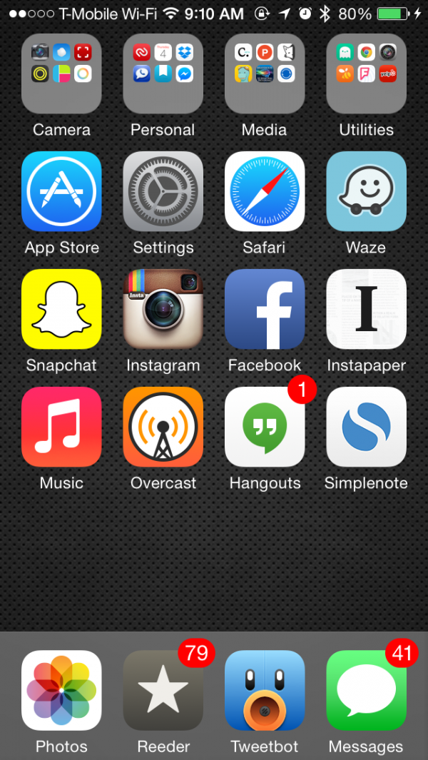
I've been switching around my homescreen a lot since I got the iPhone 5s. Here are some quick notes on my latest iteration:
-
Only one page for my homescreen.
-
Dark wallpaper for slightly better battery life.
-
I love keeping the bottom row of folders and the homescreen empty. It feels more spacious and gives me a natural place to swipe when I want to go to the next page.
-
I spent a lot of time organizing my less-than-important apps into four folders.
-
"Camera" folder is mostly for photo editing.
-
For the "Personal" folder, the general idea is, "If I had a personal assistant to help me organize my life, what apps would I have to give her access to?" So these apps would include: messaging, Dropbox, to-do lists, calendars, and online banking.
-
"Media" folder is for anything non-essential that I'll read, play, or watch.
-
"Utilities" is for everything else, including navigation apps.
-
My most frequently-used messaging apps get a spot on the homescreen so their badge notifications keep me up-to-date.
-
The four apps in the dock are by far my most frequently used apps.
-
Photos app gets a spot on the dock because, with iOS 8 especially, I do all of my photo touch-ups there.
-
Phone app is under the Personal folder. I'm not much of a phone person. 85% of my calls are to my parents and my brother, whom I just call via Siri.
-
Tweetbot is my primary method of keeping up with breaking news, tech bloggers, friends, and NBA news. (I have separate Twitter accounts for each and just swipe-left on Tweetbot’s navbar to switch accounts.)
-
Reeder is mostly for following blogs and articles that aren't news-breaking, e.g. Lifehacker.
-
Waze is placed near the top-right for easy thumb access while I’m driving.
Tweet me for any questions! @meltajon
