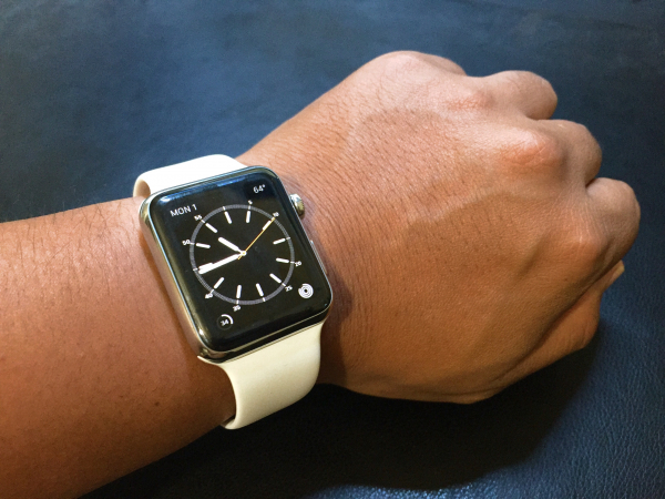
Apple Watch 42mm Stainless Steel

My First Month with Apple Watch

After two years of speculating and writing about it, the Apple Watch is finally here! It’s been over a month since I chased down my UPS guy for my missed package, and now I have enough personal experience to share my thoughts on it.

A Little Background

In the past few years, I’ve made a conscious effort to use my phone less. Specifically, to stop texting while driving, and stop fiddling with my phone when I’m out with friends. That means less documenting my life on social media and simply living more in the moment.

Did you know the average smartphone user checks their phone 150 times per day? That means two things:

  1. People waste time throughout the day just reaching into their pockets/bags, pulling out their phones, checking notifications, and then putting them back into their pockets/bags.

  2. People obsessively hold their phones in their hands (or at least keep within arms reach) at all times throughout the day.

Just look at Facebook and count how many photos include people holding their phones. People holding their phones at the dinner table. On the dance floor. While drinking with friends. At the swimming pool. Out camping. All because we’ve trained ourselves to disconnect from the moment just so we can stay “connected” to everyone else in the world over text and social media.

My First Smartwatch

Someone once said:

The desktop is meant to be used hours at a time. Phones for minutes at a time. Watches for seconds at a time.

That just made a ton of sense to me. I realized if I could just relieve my phone of push notification duties, all of a sudden I could drastically cut down my phone usage and just keep my phone in my pocket.

So last year, for my birthday, I went ahead and bought a Pebble smartwatch.

Why I Loved My Pebble Smartwatch

  • I could stay on top of notifications while shooting hoops in my backyard.
  • I could control the music on my phone speakers while showering.
  • I could read push notifications while stuck in traffic more easily.
  • When I woke up from a nap and couldn’t find my iPhone, I could hit the play button to make my phone play music.
  • When I walked my dog, I could control my music while keeping my phone in my pocket.

Dislikes About Pebble Smartwatch

  • It was ugly. As much as I loved the utility, I hated the way it looked, especially how it clashed with everything when I dressed up. It just screamed “computer nerd” to anyone who saw it.
  • While getting notifications on my wrist was extremely helpful, I still needed to grab my phone to act on those notifications.
  • It was fucking ugly.

Enter Apple Watch

Even before I got my Pebble, I knew the Apple Watch was coming. I knew it was going to look like a watch, not a fitness band, because of all the executives/creatives they were recruiting from the fashion industry. I knew it was going to offer tighter integration with the iPhone (and the entire Apple ecosystem), better than any other third-party smartwatch/fitness band will ever offer, because that’s just how Apple rolls.

For the first time ever, even before the product was announced, I knew I was going to get one.

I’ve always dreamed of having a Dick Tracy/Power Rangers watch as a kid. I’ve always loved the craftsmanship of timepieces ever since high school. I’ve always respected the simplicity and elegance of Apple’s industrial design since my first iPod.

And now, the Apple Watch is in my life. With over a month of hands-on time under my belt, here’s everything I learned:

Early Observations

  • It is NOT a smartphone. It’s a dashboard and remote for your phone. Once I realized that, it became easier to manage expectations.
  • It is not something you play with. It’s something you set and forget.
  • It takes weeks to find the right balance of notification settings.
  • It is best used in short bursts. Holding up my arm for longer than 5 seconds is not only uncomfortable, but really awkward in public.
  • Taptic feedback is nice step up from standard vibration. It literally feels like it’s tapping you. Plus, Apple did a brilliant job complimenting taps with the right sounds. An alert that sounds like a bell ringing also feels like a bell ringing on my wrist.
  • Battery life is much better than expected. I always have about 40% of battery to spare when I go to bed.
  • Switching watch straps has a profound affect on the personality of the watch. I already own two sport straps (black and white) and plan on ordering a custom leather strap for formal occasions.
  • I feel so naked without it now. There are those awkward moments in the morning when I look at my wrist to check weather and realize I haven’t put on my watch yet.
  • My first Apple Watch sighting in the wild: a woman in her mid-40s. As a nurse, she bought the watch for notifications and messaging while she works.
  • It’s showerproof! After watching videos of divers jumping off a high dive with their Apple Watches, I shower with my watch after working out with it.
  • Having an accurate health tracker with a screen that displays graphs is much more motivating than a small Fitbit screen that only displays numbers.
  • Battery life on my iPhone has improved noticeably since the screen no longer lights up for each incoming notification.

How I Use My Apple Watch

  • I use the Workout app to track my heart rate and physical activity while doing basketball drills. I don’t stop until I at least fill the Exercise Ring.
  • I’ve responded to texts using dictation while shooting hoops in the backyard. No more using my shirt to wipe dirt off my hands and touching my phone to respond. My watch gets a nice rinse when I shower anyway.
  • I’ve answered a quick phone call on my watch in the middle of giving my dog a bath. No rushing to dry my hands since it’s showerproof.
  • I thoroughly enjoy the freedom of walking around the house in my undies while my phone is charging. No pockets? No problem. Phone calls and iMessages get forwarded as long as I’m on the same WiFi network.
  • I check into Foursquare with just a couple swipes and a tap.
  • Every morning I get into my car, I start my podcast player, Overcast, from my watch.
  • I control my Apple TV with my watch. No more searching the couch cushions for the Apple Remote.
  • Because it’s power efficient and charges reasonably fast, I now sleep with my Apple Watch. When I wake up, I charge it for 20-30 minutes in bed while I catch up on social media and news feeds on my phone. By the time I’m done, I’ll have about 80% battery life, which has been plenty. At night I give it another 20-30 minutes of charging.
  • When I’m out with friends, I keep sound notifications on to make it clear to others that I’m checking my notifications, not bored of their company. When I’m at work, I put it on silent and rely on the haptic feedback.
  • Unlike a smartphone, I’ve found that the fewer apps, the better.
  • The best workflow I’ve found for managing notifications: have all phone notifications forward to the watch but only have time-sensitive ones tap your wrist. When a notification comes in, swipe down to dismiss it. Otherwise, use Notification Center on the watch to catch up on any you missed and Force Touch to Clear All.

Minor 1.0 Annoyances

  • 98% of third-party apps for Apple Watch suck…for now. But that’s understandable because no developers had an actual watch to test with. Now that developers have watches, they will move quickly to build apps that make sense on a wrist.
  • It’s hard to auto-activate the screen when lying down (so I’ve learned to touch the screen instead).
  • Back-swiping to go back a screen is very inconsistent across apps. On a screen this small, all apps should embrace gestures more instead of fully relying on tiny-ass buttons.
  • Am I using a Glance or an app? Sometimes I think I’m using a Glance and swipe down to close it, but it’s actually an app and swiping down does nothing.
  • When my phone is outside of Bluetooth range but still on WiFi range, I can still still receive iMessages and phone calls on my watch. Unfortunately, no other notifications relay the same way.
  • While receiving heartbeats via Digital Touch are in real-time, receiving taps are not.
  • I occasionally find myself swiping down to access Notification Center, but that gesture only works in Watchface mode.
  • The side button really should be customizable. Right now it is used to open the Friends app, but for such a personal device, each person should be able to assign it to their most-used app.

The good news is, all of these annoyances can be fixed over time with software updates. Remember, once upon a time, the first iPhone didn’t support picture messages or even copy/paste.

Now that I have my observations out of the way, here are the most typical reactions I hear:

“I don’t want all my notifications on my wrist! I’ll be even more distracted!”

Some notifications are worthy tapping your wrist for your immediate attention (i.e. phone calls and emails from your boss). Other notifications definitely aren’t. There are plenty of notification settings to help you prioritize the important ones.

The great thing about having notifications on your wrist is it’s much more convenient to glance at than reaching into your pocket, checking your phone, and putting it back into your pocket.

Remember, the average person checks their phone 150 times per day. Seconds add up.

“Android’s had that for years!”

Smartwatches in general have been around for over a decade. The problem is, each and every one of them have been too clunky and/or too geeky to get any sort of mass market appeal.

All but one Android Wear device measure in at 46mm (with the lone exception being 42mm). Apple Watch comes in 38mm and 42mm and include a wide range of meticulously-crafted official straps that even luxury watch enthusiasts are applauding.

Good luck convincing millions of non-techie men and women that a one-size-fits-all 46mm chunk of metal is fashionable.

In the real world, when it comes to smartwatches, looks matter more than specs and features. Just look at #AndroidWear vs. #AppleWatch on Instagram and compare the demographics of each platform.

“It’s going to be obsolete in two years.”

A totally valid concern. The general assumption is the Apple Watch will be updated every year and redesigned every two years, just like the iPhone. But that is only an assumption.

Another possibility is the Apple Watch will be updated more like the MacBooks. Every year, the internals are updated but the actual device gets a full redesign every 3-5 years.

We’ll just have to wait and see.

“Should I get one?”

Depends.

If you are a techie, Apple enthusiast, mobile app developer, or early adopter with the disposable cash, definitely get one! I’d recommend the low-end Sport editions, just in case Apple launches a much better v2.0 next year and you’ll want to upgrade immediately.

To everyone else, I will give a more conservative answer — hold off for now. Wait until a really great watch app emerges from the App Store. There is no rush. The iPhone didn’t become a mainstream success until the iPhone 4.

If the Apple Watch is something that you have to save up for, save for v2.0. Historically, 2.0 Apple devices have been huge upgrades over the original models.

(If Christmas comes around and your girlfriend already has an iPhone and iPad, then sure, get a pair of Apple Watches for yourselves.)

As for me, I am one happy customer. This is a nice upgrade over my old Fitbit, a huge feature upgrade over my Pebble smartwatch, and I get an early glimpse of Apple’s vision of the future. Every time a big company launches a watch app, or a big chain adds support for Apple Pay, or a home appliance company adds support for Apple HomeKit, the Apple Watch becomes more valuable.

Consider this:

Back in 2008, when the iTunes App Store first launched, nobody had any idea we’d end up with phenomenons like Instagram, Snapchat, and Uber. What killer apps will the Apple Watch bring in 5 years?

I can’t wait to find out.

In the meantime, I’m enjoying putting my phone down, focusing more on the world around me, and living more in the moment with my dog, my family, and my friends.

My First Android

For that past couple years, I've felt that I could totally be happy with an Android as my phone and an iPad as my secondary mobile device. I felt the smartphone should be for communication and the iPad should be for everything else. So for Christmas, I decided it was time to step outside of my Apple bubble.

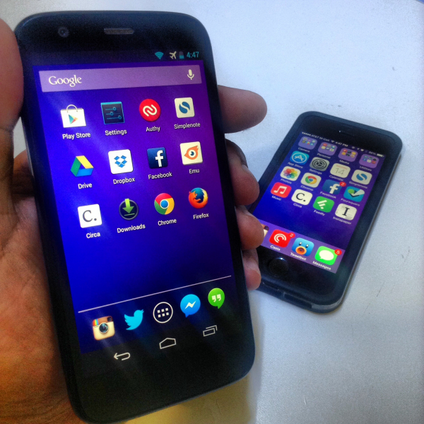
I bought the Moto G.

"Why did you switch??"

Let me clarify: I didn't switch. I'm still a very happy and loyal iPhone user. But there are two reasons why I bought my first Android.

Mobile Web Development

For most of my career, I've worked at marketing agencies where my job was to pump out as many sites as quickly as possible. But now that I'm an in-house web developer, all my projects are ongoing and long-term. For the first time in my career, I finally have the opportunity/responsibility to optimize my sites to be as fast as they can be.

As the mobile internet continues to grow, I need to be able to stay on top of both Android and iOS.

Google

When it comes to web services, nothing beats Google. And to be frank, I don't trust iCloud. I don't use iCal, iMessage, @iCloud.com email, iChat, or Safari. Instead, I use Gmail, Google Calendar, Hangouts, Google Drive, Google Voice, and Chrome.

To me, investing in Android doesn't mean "switching sides." Rather, I see it as moving myself closer to Google, a company that I've always loved for their web services.

"Why'd you pick the Moto G??"

For an unlocked smartphone with the latest OS, you simply cannot beat $179. And because it's manufactured by Motorola, a Google company, I have faith the device will have great support for OS updates in the future.

As a budget phone, the Moto G does have its shortcomings. The camera sucks, there is no LTE support, and it's only 16 GB…but none of those matter to me! I only need to be able to test my sites in the web browser. Anything else is a bonus.

Speaking of bonuses, the Moto G comes with 50 GB of complimentary Google Drive space.

To me, the Moto G is the iPod touch of Android that just happens to have phone capabilities.

What I Love About Android

  • App Defaults & Intents — One specific problem for me is finding the right video player that works with all my cloud/network drives. On iOS, I'd constantly be making trade-offs. I'd find a video player with a great interface…but had shitty cloud integration. Or I'd find a video player with great cloud integration…but a shitty interface. With Android, I can easily pick an episode of Modern Family from my Dropbox and open it in MX Player Pro.
  • LED notifications — It's smart, simple, and saves a lot of battery by not lighting up the touchscreen everytime a push notification comes in. If they had this for iPhone, I'd use this to notify me of unread messages from certain people. (But then again, maybe smartphone LED notifications will be overshadowed by push-enabled iWatch/smartwatches.)
  • Launcher & Lock Screen customization — This has a lot of potential. Aviate, Cover, and Facebook Home are all playing with some innovative ideas but I'm still waiting to see one launcher/lock screen app that really nails it.
  • Bigger screens are awesome for reading and watching videos. The two most-used apps on my iPad mini are Netflix and Instapaper. Being able to do these on a large-screen phone is pretty damn nice.

What I Don't Like About Android

  • Inconsistency of the Back button — This thing drives me NUTS. Sometimes, it's just intuitive to be able to jump back to the previous app with a tap of the Back button. Other times, when I expect to get to an app's main screen, the Back button just throws me back to the homescreen.
  • Shitty interactions — Overall, the Android interface is good enough to do its job but it's the lack of the fun, interactive bouncing and physics that sets it a notch lower than iOS.
  • Inconsistency of icon design. The homescreen just looks so damn ugly on Android because all of the app icons look completely different. Icon gradients, sizes, shapes, and even the rounded corners are just all over the place.
  • Big screens are annoying for one-handed use. While I really love having the extra pixels for reading and watching videos, it's annoying to navigate around the phone with just one hand. I constantly have to change my grip to navigate around.
  • Mini-USB is annoying after being spoiled by Apple's Lighting connector. "Did I plug it in the right way? Nope. Okay, lemme flip it over. Hmm, that didn't work either. Lemme flip it over again. Okay, there we go."
  • I have yet to find an Android-exclusive app that I really love.

"What would it take for you to switch to Android?"

I quickly learned 90% of the iOS apps I really care about have an Android counterpart (e.g. Chrome, Circa, Dropbox, Feedly, Google Hangouts, Instapaper, Netflix, Simplenote). But there are few things that iOS does better than Android for me:

Syncing Twitter between Desktop and Mobile

Twitter is huge for me. I use Twitter Lists to stay on top of four things: tech news sites, tech bloggers, friends, and basketball.

Tweetbot for Mac/iOS syncs timeline positions across devices seamlessly. It's an underrated killer feature that separates Tweetbot from all other Twitter apps.

In addition to timeline syncing, Tweetbot also does an amazing job of syncing mute options. #NFLteams, #NHLteams, #TVshows, #horoscopes, tumblr.co, instagr.am, etc…all that shit is off my Twitter timelines, both on my iPhone and Mac. Mute once, muted everywhere.

Maintaining My 10 Year Old Music Library

This coming April, my iTunes library turns ten. That's ten years of obsessively organizing, rating, and tagging over 6,500 songs. With each song properly tagged, I'm able to dynamically create really awesome Smart Playlists.

Amazon Music, Google Music, and Spotify are not compelling enough for me to throw away my 10-year investment in iTunes.

Take Great Photos

The iPhone 5s' burst mode is totally the underrated killer feature. When I take action photos of my niece and nephews running around, I never miss a moment because I can take 10 shots/second and full resolution.

To be fair, I have yet to play with the cameras of other Androids.

Closing Thoughts

Overall, after a month of owning the Moto G, I've found that Android is really good…but it's not great. I like it…but I don't love it. I really like how Android gives me a ton of customization options…but I don't love any of the options.

(Sidenote: When iOS 7 came out, a lot of Apple haters cried out "Apple copied Android!" I have no fucking clue what the fuck they were talking about; iOS 7 is nothing like Android.)

The Android ecosystem has come a long way these past two years and I can confidently say it satisfies 90% of my app needs. The phablet form factor is something that's growing on me, especially because my vision has degraded from cataract and eye surgery.

If I were to seriously consider switching from iOS to Android, it'd basically come down to one simple question:

Which solves my computing problems more: tighter integration with Google services or tighter integration with Mac apps?

For now, I'll have to stick with the latter.

Maybe over time, things will change. Maybe my interest in Twitter will diminish. Maybe an iTunes competitor will invent a smarter, more automated way to organize my music. Maybe Google will conquer the next era of computing — wearable computers, smart TVs, smart car displays, and home automation.

Until any of that happens, I plan on keeping the iPhone as my daily driver while having the Moto G riding shotgun.

Update: After less than a month of getting my first Android, I've decided to return my Moto G. I also recycled my iPad mini at Gazelle.com and used the money from both to purchase a 32 GB Nexus 5 (Google Play Edition).

While the iPhone 5s is still my best option as a primary mobile device, the Moto G worked out so well as a secondary mobile device (for reading, streaming, and mobile web development) I decided to consolidate my iPad mini and Moto G into one legit Android.