Apple Watch's Other Underrated Feature →

Out of all the Apple Watch reviews that came out today, only one person brought this up. Ben Bajarin:

Primarily around the notification and glance-able data experience, I saw a behavioral shift in how I used my iPhone. In many ways the Apple Watch untethered me from my iPhone the way the iPhone untethered me from my PC. I was free to leave my phone somewhere in the house, at my desk, or in my pocket, and focus more on the moments of real life. Sometimes it was a meeting, at home, out in my yard, at the kid’s tennis match, etc. There was peace of mind knowing I can leave my phone out of sight or mind but still have access to the relevant information or notifications and even be able to interact and respond to them. The most important interactions and information are no longer only accessible on my large screen smartphone. This experience, of moving key functionality from my iPhone to my wrist, proved to add a significant amount of value to my overall day.

Smartphones are known as digital leashes. Our phones are always within an arm's reach, constantly begging us to pick up, play with, and distract us from the things that matter. All of the other reviews talked about the Apple Watch giving you less reason to reach into your pocket for your phone but Ben Bajarin is the only person to talk about how much more freedom you'll have at home with your family, just by leaving your phone at his desk.

Cooking dinner for the family. Spending quality time with your kids. Having playtime with your dog. Gardening in the front yard. Shooting hoops in the backyard. Working out in the garage.

When you're at home, you should feel at home; you shouldn't have to feel obligated to stay leashed to the world through your phone. With a smartwatch, as long as you set up the your notifications right, you'll be given back some more of your time, as well as your freedom, to enjoy the things that actually matter.

The Apple Store Advantage →

Matt Richman:

The challenge of selling Apple Watch illustrates their foundational nature. Apple Watch is technology combined with jewelry, a product that must be experienced to be fully understood.

Jewelers, however, are unequipped to sell technology, and technology retailers are unequipped to sell jewelry. But because Apple has its own stores, the company can redesign them to sell a product that’s a combination of both.

Without Apple Stores, there would be no place to properly experience the Watch, so it would have a far smaller chance of success. Apple Stores are a crucial foundation for Apple Watch — and Apple’s competitors have nothing truly comparable.

The Secret History of the Apple Watch →

David Pierce at Wired wrote up a really, really great interview with Kevin Lynch, the software lead for Apple Watch. Lots of great stuff to unpack. Here are all my highlights of the piece, starting with this:

Along the way, the Apple team landed upon the Watch’s raison d’être. It came down to this: Your phone is ruining your life. Like the rest of us, Ive, Lynch, Dye, and everyone at Apple are subject to the tyranny of the buzz—the constant checking, the long list of nagging notifications. “We’re so connected, kind of ever-presently, with technology now,” Lynch says. “People are carrying their phones with them and looking at the screen so much.” They’ve glared down their noses at those who bury themselves in their phones at the dinner table and then absentmindedly thrust hands into their own pockets at every ding or buzz. “People want that level of engagement,” Lynch says. “But how do we provide it in a way that’s a little more human, a little more in the moment when you’re with somebody?”

Our phones have become invasive. But what if you could engineer a reverse state of being? What if you could make a device that you wouldn’t—couldn’t—use for hours at a time? What if you could create a device that could filter out all the bullshit and instead only serve you truly important information? You could change modern life. And so after three-plus decades of building devices that grab and hold our attention—the longer the better—Apple has decided that the way forward is to fight back.

Apple, in large part, created our problem. And it thinks it can fix it with a square slab of metal and a Milanese loop strap.

The team quickly learned that smartwatch must be used only a few seconds at a time:

Figuring out how to send a text was illuminating. Initially the process was a lot like texting on an iPhone: addressee here, message here, confirm message. Tap to send. “It was all very understandable, but using it took way too long,” Lynch says. Also, it hurt. Seriously: Try holding up your arm as if you’re looking at your watch. Now count to 30. It was the opposite of a good user experience. “We didn’t want people walking around and doing that,” Dye says. [...]

As the testing went on, it became evident that the key to making the Watch work was speed. An interaction could last only five seconds, 10 at most. They simplified some features and took others out entirely because they just couldn’t be done quickly enough. Lynch and team had to reengineer the Watch’s software twice before it was sufficiently fast. An early version of the software served you information in a timeline, flowing chronologically from top to bottom. That idea never made it off campus; the ideas that will ship on April 24 are focused on streamlining the time it takes a user to figure out whether something is worth paying attention to.

The most common concern I hear from non-techies is, "I'm going to be even more distracted with notifications than my phone!" The Apple Watch team always knew this:

The team had to build software that presented everything you needed without being overwhelming. Fall short of that goal and users might start taking their Watches off, annoyed by the incessant buzzing, at which point the Apple Watch becomes the most personal device you ever bought and then immediately returned. By the time Lynch and his team had finished their third round of software, Ive, Dye, and everyone else believed that they’d nailed the balance.

This next part shows how perfectionist the team is with their craftsmanship.

Audible feedback is the most underrated aspect of design and touch feedback is still very new. I know, I know, Android devices have "had touch feedback for years!"...but they've always felt gimmicky and mechanical. The Apple Watch team spent a ridiculous amount of time making the audible and touch feedbacks feel natural and organic:

Apple tested many prototypes, each with a slightly different feel. “Some were too annoying,” Lynch says. “Some were too subtle; some felt like a bug on your wrist.” When they had the engine dialed in, they started experimenting with a Watch-specific synesthesia, translating specific digital experiences into taps and sounds. What does a tweet feel like? What about an important text? To answer these questions, designers and engineers sampled the sounds of everything from bell clappers and birds to lightsabers and then began to turn sounds into physical sensations.

There were weekly meetings where the software and interface teams would test out, say, the sound and feeling of receiving a phone call. Ive was the decider and was hard to please: Too metallic, he’d say. Not organic enough. Getting the sounds and taps to the point where he was happy with them took more than a year.

This sums up the purpose of Apple Watch perfectly:

If the Watch is successful, it could impact our relationship with our devices. Technology distracts us from the things we should pay the most attention to—our friends, moments of awe, a smile from across the room. But maybe a technology can give those moments back. Whether Apple is the company to make that technology is the three-quarters-of-a-trillion-dollar-market-cap question.

Lynch is leaning forward in his chair, telling me about his kids: about how grateful he is to be able to simply glance at his Watch, realize that the latest text message isn’t immediately important, and then go right back to family time; about how that doesn’t feel disruptive to him—or them.

A moment later, he stands up. He has to leave; he owes Dye and Ive an update on something important. In all the time we’ve been talking, he’s never once looked at his phone.
"Looks like Apple copied the Samsung Gear" →

A typical response I see on the daily. But here's what really happened.

NY Times on December 18, 2011:

Over the last year, Apple and Google have secretly begun working on projects that will become wearable computers. Their main goal: to sell more smartphones. (In Google’s case, more smartphones sold means more advertising viewed.) [...]

Apple has also experimented with prototype products that could relay information back to the iPhone. These conceptual products could also display information on other Apple devices, like an iPod, which Apple is already encouraging us to wear on our wrists by selling Nanos with watch faces.

A person with knowledge of the company’s plans told me that a “very small group of Apple employees” had been conceptualizing and even prototyping some wearable devices.

One idea being discussed is a curved-glass iPod that would wrap around the wrist; people could communicate with the device using Siri, the company’s artificial intelligence software.

Fifteen months later, Bloomberg reports :

Samsung Electronics Co. is developing a wristwatch as Asia’s biggest technology company races against Apple Inc. to create a new industry of wearable devices that perform similar tasks as smartphones.

"We’ve been preparing the watch product for so long," Lee Young Hee, executive vice president of Samsung’s mobile business, said during an interview in Seoul. "We are working very hard to get ready for it. We are preparing products for the future, and the watch is definitely one of them." [...]

Samsung’s disclosure comes after people familiar with Apple’s plans said last month the U.S. company has about 100 product designers working on a wristwatch-like device that may perform similar functions to the iPhone and iPad. The global watch industry will generate more than $60 billion in sales this year, and the first companies to sell devices that multitask could lock customers into their platform, boosting sales of phones, tablets and TVs.

Sorry, Apple haters. The Apple Watch was well into development before Samsung came along.

Even then, Apple has never cared about being first. Tim Cook explains:

These are lots of insights that are years in the making, the result of careful, deliberate...try, try, try...improve, improve, improve. Don’t ship something before it’s ready. Have the patience to get it right. And that is exactly what’s happened to us with the watch. We are not the first.

We weren’t first on the MP3 player; we weren’t first on the tablet; we weren’t first on the smartphone. But we were arguably the first modern smartphone, and we will be the first modern smartwatch—the first one that matters.

Why do I need a smartwatch? →

Michael Wolfe:

"Why do I need a laptop? If I really need to get some work done, I’ll just go back to my desk."

"Why do I need a cell phone? I already am paying for phones at home and work, and I can use a payphone in a pinch."

"Why do I need a smartphone? I have a cell phone, and I can grab my laptop if I want to get on the web."

"Why do I need a tablet? I have a laptop."

Typical responses by mainstream consumers whenever an innovative new technology is on the horizon.

Who wants the gold Apple Watch? China →

Jack Linshi:

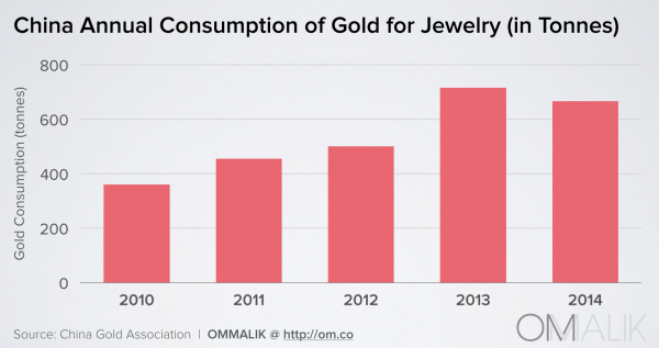
The Apple Watch’s biggest advantage in China is deceptively simple: Few Chinese consumers laugh when Apple touts the device as a luxury item. Apple became China’s top luxury brand for 2015, outranking labels like Louis Vuitton and Gucci. More recently, Apple’s status has risen as Chinese consumers of luxury goods prioritize functionality over ostentatiousness—a taboo that China’s President Xi Jinping deplored as “unhealthy,” criticizing Chinese elites’ obsession with status symbols like Rolex watches. [...]

While Americans will compare the Apple Watch’s $349-$17,000 price tag to the cost of consumer electronics, Chinese consumers are more likely to stack it up against luxury timepieces. The worldwide median price of a luxury watch is about $10,700, according to DLG. That means the Apple Watch Sport (starting $349) and Apple Watch (starting $549) are inexpensive by comparison, while the gold and silver Apple Watch Edition models that start at $10,000 aren’t crazy purchases.

As an American, it's too easy to forget that there are other markets out there just as big as the United States. While the gold Apple Watch has been getting slammed here by the media, Tim Cook is keeping his eyes on the prize — China is a huge opportunity and a high priority for Apple.

Top 4 Android Wear Smartwatches ComputerWorld

Why Android Wear 1.0 Will Flop →

9to5mac:

Here are the Apple Watch dimensions:

  • 38 mm model: 38.6 x 33.3 x 10.5 mm
  • 42 mm model: 42 x 35.9 x 10.5 mm

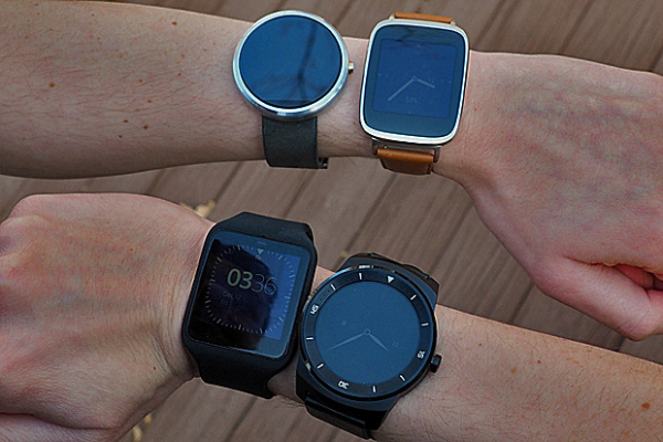
And here are some of the dimensions of popular Android Wear devices:

  • Asus ZenWatch: 51 x 39.9 x 7.9 ~ 9.4 mm
  • LG G Watch R: 53.6 x 46.4 x 9.7 mm
  • Moto 360: 46 x 46 x 11.5 mm
  • LG G Watch: 46.5 x 37.9 x 9.95 mm
  • Sony SmartWatch 3: 51 x 36 x 10 mm
  • Samsung Gear Live: 56.4 x 37.9 x 8.9 mm
  • Huawei Watch: 42 x 42 x 11.3 mm

Since we're just beginning the Smartwatch 2.0 era and we're waiting to see if smartwatches will gain traction with the mainstream consumer, there are two important questions to ask:

  • How many women will wear a smartwatch?
  • How many women will pay to wear a smartwatch?

If the answer to the first question isn't favorable (at least a few million), there's no point in even asking about the second one.

So when I look at the dimensions of these Android Wear 1.0 watches, the question comes up: how many women will wear a masculine-looking gadget on their wrist that is over 46 mm?

Apple, on the other hand, has designed a watch in a size suitable for women. Now, I'm not saying that all women will buy an Apple Watch, but I bet there will be a hell of a lot more women in the Apple Watch corner than the Android Wear corner.

That "Aha!" Moment with Digital Touch →

Non-Techie Girl #1:

That changes the game for messaging I think for really young people. And it's right on my wrist. It's so easy, I love it!

Non-Techie Girl #2:

If I'm at a party and a guy is being super creepy, I could just double-tap it, that will be like, "Come save me, right now! Rescue me!"

Girl code taken to the next level.

As I've said before, I really do believe Digital Touch is an underrated feature that will become a fan favorite. Something like how front-facing cameras on phones were never considered revolutionary, yet people LOVE selfies and it's become a big part of our culture.

While I don't think people will buy an Apple Watch for Digital Touch, I do see people falling in love with it once they start using it.

And this won't be a feature that people will use with all their friends. Rather, it will be used with their closest friends, which is actually even more powerful.

(Note to the haters: this BuzzFeed video was NOT paid for by Apple)

The Apple Watch is Time, Saved →

Matthew Panzarino:

People that have worn the Watch say that they take their phones out of their pockets far, far less than they used to. A simple tap to reply or glance on the wrist or dictation is a massively different interaction model than pulling out an iPhone, unlocking it and being pulled into its merciless vortex of attention suck.

One user told me that they nearly “stopped” using their phone during the day; they used to have it out and now they don’t, period. That’s insane when you think about how much the blue glow of smartphone screens has dominated our social interactions over the past decade.

This is exactly what I've experienced since getting my Pebble smartwatch last year. It's helped me greatly in getting me to stop fiddling with my phone when I'm out with friends while still allowing me to stay on top of urgent notifications, usually from my boss.

It really doesn't seem like much, but the time you save by not having to whip out your smartphone every time you get a notification really starts to add up. Being able to stay on top of your notifications with a half-second glance has done wonders for allowing me to live more in the moment instead of behind my iPhone.

This time and attention-saving solution is definitely not the most sexiest feature to market, but it's something that everyone will benefit from once they actually experience it.

Communication by Touch →

This. Exactly this. But built into the Apple Watch.

When Apple first announced communication as one of Apple Watch's three tent pole features, it sounded gimmicky to me. But the more I thought about it, the more I saw beauty in how well it humanizes technology.

This isn't a feature that will wow you when you read about it. This isn't something that will jump out at you when you read tech specs or feature lists. Rather, this is the kind of feature that you may very well fall in love with once you actually experience it. This is about making an emotional connection.