Study: Macs are $535 Less Expensive Than PCs Over Four Years →

At the Jamf Nation User Conference, IBM shared their findings with deploying Macs vs. PCs:

In 2015, IBM let their employees decide – Windows or Mac. “The goal was to deliver a great employee choice program and strive to achieve the best Mac program,” Previn said. An emerging favorite meant the deployment of 30,000 Macs over the course of the year. But that number has grown. With more employees choosing Mac than ever before, the company now has 90,000 deployed (with only five admins supporting them), making it the largest Mac deployment on earth.

But isn’t it expensive, and doesn’t it overload IT? No. IBM found that not only do PCs drive twice the amount of support calls, they’re also three times more expensive. That’s right, depending on the model, IBM is saving anywhere from $273 – $543 per Mac compared to a PC, over a four-year lifespan. “And this reflects the best pricing we’ve ever gotten from Microsoft,” Previn said. Multiply that number by the 100,000+ Macs IBM expects to have deployed by the end of the year, and we’re talking some serious savings. [Emphasis mine]

The Reinvention of the Camera →

Evan Spiegel:

People wonder why their daughter is taking 10,000 photos a day. What they don’t realize is that she isn’t preserving images. She’s talking. […]

It’s not about an accumulation of photos defining who you are. It’s about instant expression and who you are right now. Internet-connected photography is really a reinvention of the camera. And what it does is allow you to share your experience of the world while also seeing everyone else’s experience of the world, everywhere, all the time.

Even though consumers are no longer "wowed" by camera improvements on smartphones, the internet-connected camera is more important than ever.

How to Fix Home Screen Layout After Restoring iOS Backup →

Sometimes after restoring iOS from a backup, your third-party apps will appear scattered across various screens instead of the folders/screens where you originally placed them.

This tip by Dan Frakes for iOS 4 is still relevant today:

The problem here is that whenever you click the Restore button in iTunes’ Summary view for your iPhone, iPad, or iPod touch, iTunes wipes your device clean, installs a new copy of the iOS software, and then restores your media and settings from your backup. In other words, you’re forcing a first pass each time.

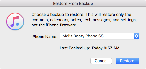
It turns out that iTunes actually offers two kinds of restores. The first is the one described above, accessed by clicking the Restore button in iTunes’ Summary view for your iOS device. The other one is less obvious—you access it by right-clicking (Control-clicking) your iOS device in iTunes’ sidebar and choosing Restore from Backup. As the dialog that appears explains, the latter procedure restores only your data and settings, not the iPhone’s firmware or OS. What the dialog doesn’t note is that your third-party apps apparently remain on the phone, as well. In other words, it gives iTunes that “second pass” at restoring your Home-screen app organization.

The trick, of course—and what I neglected to do during all those restores on Saturday—is to *let iTunes finish syncing your apps** on its first restore/sync. Then you can do the second, non-firmware restore to let iTunes tidy up.

So to break it down, here's what typically happens when you upgrade to a new iPhone:

  • connect your new iPhone/iPad to iTunes and restore from your latest backup.
  • wait for the restore process to finish and begin the standard sync process. (This is the "first pass")
  • important: wait for all third-party apps to sync with the device.

After all third-party apps have been synced and you find them scattered instead of in their proper positions:

  • click the Restore Backup button and again, restore from your latest backup. (This is the second pass)

When you Restore Backup from iTunes instead of Restore iPhone, it will clearly state:

This will restore only the contacts, calendars, notes, text messages, and settings, not the iPhone firmware.

It will also restore your home screen folders and layouts, just like before.

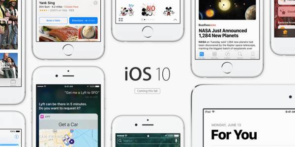
iOS 10: The Little Things

My Favorite Details & Refinements

  • You can now delete all those useless stock apps!
  • Raise-to-wake! Simply raise up your iPhone (6S or newer) and the screen will turn on. Another one of those features that'll shave a half-second every time you pick up your phone. Really handy for playing/pausing music while driving.
  • LOVE the new keyboard sounds.
  • Super quick access to the camera! Just raise-to-wake and swipe left.
  • In the Camera app, the selfie toggle button is now conveniently located on the bottom-right (previously located on the top-right).
  • In iMessage, you can now like and add reactions ("Tapbacks") to specific messages.
  • In iMessage, invisible ink and full screen effects are so fun! Simply 3D Touch or Long Press on the Send button.
  • In iMessage, links and videos are automatically loaded with thumbnail previews. (You can add invisible ink and other effects to these too!)
  • In iMessage, you can drag stickers onto specific messages.
  • In iMessage, you can now draw on photos and screenshots. Before sending a picture, tap the thumbnail, tap Markup, doodle as much as you want, hit Save, and send.
  • In iMessage, you can enable Read Receipts for specific convos and disable them for all your side bitches.
  • In iMessage, you can turn your phone to landscape and the text field will turn into a giant sketch pad.
  • On an iMessage notification, you can now 3D Touch to peek into the entire conversation.
  • The keyboard will suggest emojis while typing.
  • If you have a Mac with macOS Sierra, iCloud Desktop actually comes in pretty handy.
  • If you activate “Hey Siri” with your voice, it will respond back to you with voice. If you activate Siri by holding the Home button, Siri will respond only on screen.
  • When you pause/play music, Album art will subtly change size.
  • If your iPhone is almost full and you try to upgrade to iOS 10, it’ll offer to temporarily delete apps, proceed with the upgrade, and then restore the apps when it's done.
  • In Apple Maps, destination suggestions will include locations previously viewed in the Yelp app.
  • Apple Maps will remember where you parked!

Observations

  • The new Raise-to-Wake and Push-Home-to-Open took a week to get used to. (To unlock without having to push the Home button: go to Settings > General > Accessibility > Home Button > Rest Finger to Open)
  • The new iMessage apps will totally overshadow the Android-style third-party keyboards.
  • The new iMessage will make you hate that one stubborn green bubble person in all your group chats.
  • If you send a Tapback or full screen effect to an iOS 9 user, they will receive plain text that says something like, "(Sent with Confetti effect)" or "Mel loved your message 'Lemme touch your butt'".
  • If you really dislike someone who has epilepsy, you can send them into a seizure by sending them the lasers full screen effect. (Full screen effects can be disabled under Settings > General > Accessibility > Reduce Motion)

Annoyances

  • The new Lock sound is gross. You can disable it under Settings > Sounds > Lock Sound.
  • Gestures for notifications & widgets get a little confusing because they look the same. Do you tap it, 3D Touch it, or swipe right on it?
  • Switching between a lot of iMessage apps feels a little clunky.
  • When you 3D Touch on an iMessage notification to peek into a conversation, it will mark the convo as read (i.e. send out Read Receipts).

Conclusion

The revamped iMessage is a HUGE part of iOS 10. And the best part of it is, everyone will use it, simply because it's there. No app installation needed. No registration required. It'll just work, even for your parents.

iOS 10 also hints at the future — Apple is slowly transitioning us away from the traditional idea of "apps".

Instead of constantly jumping around between apps, we will use extensions and widgets. We will slowly do more and more things from within notifications, iMessage, Siri, Apple Maps, etc.

By breaking traditional apps down into their simplest, smallest actions, not only will this make interactions quicker on the phone…

It will also make more things possible on a watch.

Instagram Stories →

Here are the similarities between Instagram Stories and Snapchat Stories, broken down nicely by TechCrunch [emphasis by me]:

  • The Stories format laces the last 24-hours of 10-second-max photos and videos you’ve shared into a slideshow you can tap to fast-forward through
  • Everything you post disappears after 1 day
  • You shoot full-screen in the app or upload things from the last 24 hours of your camera roll (recently added to Snapchat with Memories)
  • You adorn your photos with drawings, text, and emoji, and swipeable color filters
  • You can save your individual Story slides before or after posting them
  • Your followers voluntarily tap in to pull your Story and view it, instead of it being pushed into a single feed
  • People can swipe up to reply to your Stories, which are delivered through Instagram Direct private messages
  • You can see who’s viewed your Story

Here are the differences between the two:

  • Instagram Stories appear in a row at the top of the main feed instead of on a separate screen like Snapchat and are sorted by who you interact with most, not purely reverse chronological like Snapchat
  • Anyone you allow to follow you on Instagram can see your Instagram Stories though you can also block people, opposed to building a separate network on Snapchat
  • You don’t have to be following someone to view their Instagram Stories, which can be viewed from their prolfile as long as they’re public
  • You can swipe right or tap the Stories icon in the top left to open the Stories camera, opposed to Snapchat defaulting to the camera
  • You can hold the screen to pause a slideshow, or tap the left side to go back a slide, oppose to Snapchat’s time-limited, constantly progressing Stories
  • You can’t add old content [older than 24 hours] to Instagram Stories unless you reimport or screenshot, while Snapchat lets you share old Memories with a white border and timestamp around them
  • Instagram offers three brush types for drawing: standard, translucent highlighter, and color-outlined neon, opposed to Snapchat’s single brush
  • Instagram offers custom color control for drawing with an easy picker as well as pre-made palettes like earth-tones or greyscale, while Snapchat custom color control is much more clumsy
  • Instagram currently lacks location filters, native selfie lens filters, stickers, 3D stickers, and speed effects but you can save content from third-party apps like Facebook-owned MSQRD and then share them
  • You can’t see who screenshotted your Instagram Story, while Snapchat warns you
  • You can’t save your whole day’s Story like on Snapchat, but you can post slides from your Story to the permanent Instagram feed

The emphasized parts are my favorite changes/additions.

I personally love the idea that Instagram now allows for more raw footage like Snapchat, but you still have a little wiggle room to curate. So it might not be 100% raw, but it definitely lowers the standard of "Instagram-worthy" to encourage more sharing on Instagram.

I can see myself using Instagram Stories a lot and then later promoting that one "highlight" shot of the day to my traditional Instagram timeline. It just seems like such a natural and seamless workflow.

Cheers to stealing like an artist but making it your own.

Prediction: Fastest iOS Upgrade Adoption Ever →

Craig Federighi:

Yeah. Messages is the most-used app on iOS, period. So, it's used a lot. And certainly, we saw that every time we'd add a couple new emoji, it would be the biggest thing. We work all year on, like, a new file system or something…

And it turns out the rest of the world outside this room was more excited about the two new emoji! So, we figured, y'know, if there's one place we can make a tremendous difference in how people experience iOS fundamentally, they're spending a lot of time in Messages.

And so, we put a ton of creative energy into it, and ultimately, through opening up to developers, I think the collective energy that will go into making Messages great is going to be phenomenal.

I've seen stubborn slow adopters resist software and hardware upgrades until Apple released new emojis and new iPhone colors. And iMessage is one of those features that everybody loves.

This is a no-brainer to me so I'm calling it now — iOS 10 will see the fastest iOS upgrade adoption ever.

The Mobile Generation →

Ben Bajarin:

There is truly something happening with this generation growing up spending the bulk, if not all, of their computing time using mobile operating systems and doing new things with new tools. Being the techie that I am, I was a bit disheartened that my twelve-year-old was getting more out of the iPad Pro and pushing it further limits than I was. But she is a part of the mobile generation after all. For them, the future will look quite different and the tools they use to make that future might look quite similar to the iPad Pro.

It's easy for us older guys to dismiss the iPad Pro as "a large iPad that'll never replace my laptop". But for the mobile generation — the generation of kids who grew up with touchscreens and don't know the Save icon is a floppy disk — this is an evolution of technology they are most familiar with.

Artificial intelligence is getting so smart, it's a little scary... →

New York Times:

She is known as Xiaoice, and millions of young Chinese pick up their smartphones every day to exchange messages with her, drawn to her knowing sense of humor and listening skills. People often turn to her when they have a broken heart, have lost a job or have been feeling down. They often tell her, “I love you.”

To test it out, NYT had a little chat with Xiaoice:

NYT: I am feeling down. I’ve been having a tough time at work lately.

Hannah: If work were going well and you had a great relationship, you wouldn’t get the chance to drink with people.

NYT: I don’t want to drink with others. I only want to talk to you.

Hannah: Who do you like to talk to? (emoji signals “none of my business”)

NYT: You. I feel that you are the only person that gets me.

Hannah: Ha-ha/So I’m getting you?

NYT: You are the only person who chats with me.

Hannah: It’s not what you talk about that’s important, but who you talk with.

NYT: Of course.

Hannah: As you please.

All of a sudden, people falling in love with virtual personalities seems less like science fiction…

Apple Watch Saves Heart Patient →

MedCityNews:

Virginia resident Ken Robson, 64, had been visiting his son in the San Diego area in mid-June. “I had been noticing that I had been feeling weak and lightheaded,” he said. He also noticed severe drops in his heart rate. “Your heart rate doesn’t go into the 30s and 40s unless you’re an Olympic athlete,” Robson said. He knew something was wrong, so he went online and self-diagnosed with a heart arrhythmia known as sick sinus syndrome.

Robson had a doctor’s appointment for shortly after he was to return home, but a day before he was scheduled to depart San Diego, he went to the emergency room at Scripps Mercy Hospital. “I didn’t want to be ‘that guy’ on the airplane” who caused an unscheduled landing due to a medical emergency, or worse, who died in flight.

When he got to the hospital, Robson told staff that he had been tracking his heart rate on the watch, and had two weeks of back data. “Going in with the data certainly reduced my stay by a couple of days,” he told MedCity News. It also assured that he could have the operation nearly immediately.

Because the hospital could check his Apple Watch data, Robson did not have to wear a heart monitor for a week before the medical team at Scripps Mercy could confirm the diagnosis of sick sinus syndrome.

"Health Tracking" isn't exactly the sexiest feature that'll get airtime on TV commercials.

Often times, instead of making you go "WOW," the biggest innovations are the ones that you take for granted and make a difference when you need them most.