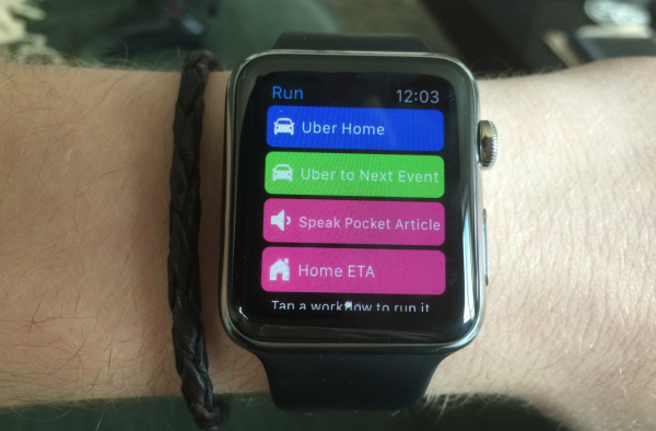
Kyle Russell of TechCrunch theorizes that Workflow, an app for iOS power users that was recently acquired by Apple, is a hint at the future of Apple Watch apps:
Instead of providing an interface with options to pick from a menu or icons representing actions, Workflow on the Apple Watch has been stripped down to verbs. I want an Uber home, or to the next meeting in my calendar. I’m walking home and want to send an ETA to my roommates. Maybe I’m on BART and it’s just too tightly packed to read on my phone — no worries, I can pick a Pocket article to be read over the headphones plugged into the iPhone in my back pocket.
There are no gestures to remember or content to download to fill a feed. It’s the perfect application for the WatchKit app paradigm, with a single tap executing multiple instructions on the phone. And if, say, a destination or article needs to be picked, the pre-made workflows in the app’s gallery will serve up a few options that users are likely to choose.
Over the coming months, most developers will figure out that the best question to ask themselves when designing smart watch apps is, “What can I help users do with a single tap?” With cameras, LTE, GPS, screen size, and battery life keeping the smartphone relevant for the foreseeable future, developers should assume that users will always have a phone on them for any action that takes longer than raising your wrist, swiping once or twice, and tapping a button or two.
Another supporting argument for Apple breaking down traditional apps into its smallest, simplest actions to make more things possible on the wrist and with your voice.
