Indoor Navigation at Gatwick Airport via Bluetooth Beacons →

TechCrunch:

The UK’s second busiest airport, Gatwick, has opted for the latter approach to power an indoor navigation system it’s launching as part of a wider, multi-year transformation program.

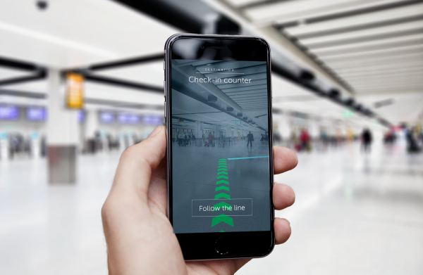
It’s now finished kitting out its two terminals with around 2,000 battery-powered beacons so that digital map users will get a more accurate blue dot as they wander around. The beacon system will also be used to power an augmented reality wayfinding tool (pictured above) — so that mobile users will be able to be guided to specific locations within the terminals via on-screen arrows. The beacon system is slated as supporting positioning with +/-3m accuracy. […]

Gatwick says it will not be collecting any personal data via the beacons but says “generic information on ‘people densities’ in different beacon zones” will be used to help improve airport operations — such as queue measurement, streamlining passenger flows and reducing congestion.

This is the first time in a while we've heard of Bluetooth beacons in the wild. This is something to watch. Venues will be motivated to adopt this for more analytics, just like Gatwick. Consumers will be motivated for easier navigation. In addition to airports, think malls and Disneyland.

This is a "boring" technology that will be fundamental to augmented reality applications in the real world.

I'm eager to see if Apple unveils more progress with their four-year old iBeacons technology.
Workflow App: The Future of Wearable and Voice-First Apps

Kyle Russell of TechCrunch theorizes that Workflow, an app for iOS power users that was recently acquired by Apple, is a hint at the future of Apple Watch apps:

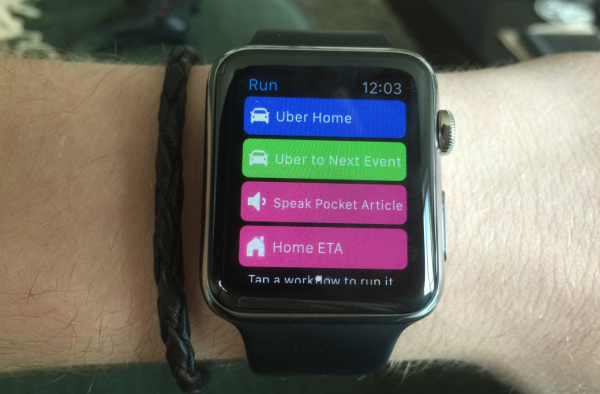
Instead of providing an interface with options to pick from a menu or icons representing actions, Workflow on the Apple Watch has been stripped down to verbs. I want an Uber home, or to the next meeting in my calendar. I’m walking home and want to send an ETA to my roommates. Maybe I’m on BART and it’s just too tightly packed to read on my phone — no worries, I can pick a Pocket article to be read over the headphones plugged into the iPhone in my back pocket.

There are no gestures to remember or content to download to fill a feed. It’s the perfect application for the WatchKit app paradigm, with a single tap executing multiple instructions on the phone. And if, say, a destination or article needs to be picked, the pre-made workflows in the app’s gallery will serve up a few options that users are likely to choose.

Over the coming months, most developers will figure out that the best question to ask themselves when designing smart watch apps is, “What can I help users do with a single tap?” With cameras, LTE, GPS, screen size, and battery life keeping the smartphone relevant for the foreseeable future, developers should assume that users will always have a phone on them for any action that takes longer than raising your wrist, swiping once or twice, and tapping a button or two.

Another supporting argument for Apple breaking down traditional apps into its smallest, simplest actions to make more things possible on the wrist and with your voice.

Smart Devices & Dumb Screens →

This is exactly what I envision Apple will do with the iPhone. The iPhone matures enough to replace your PC and then you just wirelessly sling the interface to a variety of "dumb screens," whether it be a tablet-sized screen, a laptop-sized screen with a keyboard, a desktop monitor with keyboard & mouse, a TV, or even a car center console.

Then years down the line, the Apple Watch — or another computing device that is always on you — replaces the iPhone as the centerpiece of your digital life.

As for this Neptune Duo? It demos really well but A) it's too masculine-geeky for mainstream, and B) it'll be severals years until the technology is good & cheap enough to make this idea into something more meaningful.

Apple Watch's Rumored 3-Hour Battery Life →

Kit Eaton:

Fans are happy because 19 hours of “mixed” use, with the watch mainly on standby and in typical-to-heavy use for only about 2.5 to 3.5 hours a day is actually quite generous—it means a nightly charge during a typical 8-hours of bed time is going to be more than enough. [...]

19 hours sounds very reasonable. Picture yourself looking at and interacting with your watch for 2–3 seconds at a time as you read notifications, with the occasional 10–20 seconds used to respond to something like a tweet or text message. Add in less frequent longer interactions lasting a few minutes (like making a phone call or playing a game—even though we don’t know exactly how much game play Apple will ultimately allow in watch apps) and then that 3-hour “heavy” use window looks quite generous. You wouldn’t want to stare at such a small screen for much longer each day anyway.

I've written before how the Apple Watch's battery life is a top priority. I still believe it is, but it will take a few generations before it'll be what Apple really wants it to be.

Until then, as Kit speculates, maybe 19 hours of "mixed usage" won't be that bad. I can relate to Kit's assertion that we won't be actively fiddling with our smart watches for long periods of time. As a Pebble owner, I've played with a few Pebble apps and found I fucking can't stand holding my wrist up to my face longer than 5 seconds at a time. In those longer-than-5-seconds situations, whipping out my smartphone is just way more practical.

That said, I'm curious to see how apps will mature on smartwatches. Taking a smartphone app and shrinking it down to wrist-size is not going to cut it. App developers will really have to embrace the idea of glanceable and passive user interfaces if they want to make something revolutionary.